How to development
Installation Process
In the README.md you can find a quick start guide for the installation.
After you have downloaded the repository and started the API local for the first time (see quick start guide), we will describe here how you can further develop the Style Guide.
How To Development
For the development you need git, Node.js and access to Azure DevOps. It is recommended that you develop the project using Visual Studio Code.
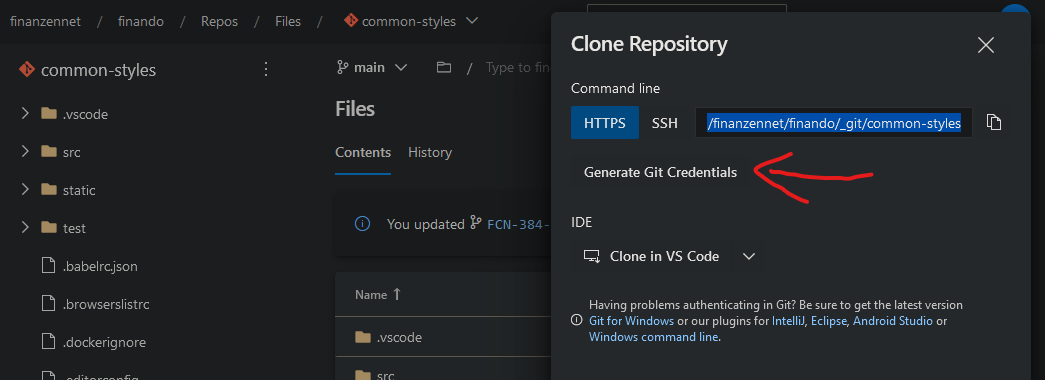
Then clone the common-styles project from the Azure Repository repository. ATTENTION: the authentication can differ from the standard. To do this, use the “Generate Git Credentials” function.
To get access to the npm packages, you need to login to Azure DevOps via npm. To do this, you have to install vsts-npm-auth once and log in with it:
- Install the vsts-npm-auth only once with
npm install -g vsts-npm-auth --registry https://registry.npmjs.com --always-auth false - To login to Azure DevOps run
vsts-npm-auth -config .npmrc -F. A login window will open, you must use your name@finanzen.net account.
First lunch
Once the repository has been downloaded and your are logged in, execute the following bash commands in the solution.
- Run
npm run refreshto install all npm dependencies with a clean slate. - Run
npm run serveto start the development environment. - Open
http://localhost:8080/in your browser, et voilà.
Learn more about the development in the How to development detail description.
Branch & Merge Policy
With a new task (ticket) create a new feature branch based from the development branch!
Do not use the
mainbranch as base for your branch. The main branch is only for production state.
The name of the new feature branch should contain the team name as path, the ticket number and a short description, like content/CB-123-new-button-variant.
After the task (ticket) is ready, merge the feature branch into the development branch. To publish the feature, read the next chapter.
How To Publish
See How To Publish.
Architecture
BEM is a method for naming CSS classes. It helps in structuring and building front end components and layouts. For more information, read BEM.
Icons
This project contains a list of icons. Our icons are basicity SVG images and will transformed with the external library fantasticon to an icon font.
Add/Edit/Remove icon
Add the SVG of the new icon to the src\assets\image\icon folder. Named that icon in pascal case pattern (like i-am-an-icon.svg) and use self explanatory names (bad: i-am-an-icon.svg, good: smiley-cool-sunglasses.svg).
Then run the command
npm run icon:font:create.
The command creates the icon font and other files in the src/assets/font/sg-icon folder:
- sg-icon.html
- sg-icon.json
- sg-icon.scss
- sg-icon.svg
- sg-icon.ttf
- sg-icon.woff
- sg-icon.woff2
After we create (or update) the icon font files, we can run the default development process. The webpack process creates the sg-icon-hash-code.json based on the current SVGs in the src\assets\image\icon folder, for example:
{"sgIconHashCode":"959504608"}
Integrate icon font in Style Guide
You do not need extra streps to integrate the icons in the Style Guide, it is automatically integrated with webpack. Here is a short explanation.
- the
sg-icon-hash-code.jsonfile is built during the webpack process, see thegenerateIconHashCode()function in webpack.config.js, this JSON file contains a hash code based on the currently existing SVGs and their content, the code is used as URL query while loading the icon font in CSS - the SCSS build can load the
sg-icon-hash-code.jsonfile (thanks to the node-sass-json-importer) and add the has code to the url of the font (see _font-icon.scss), the generated CSS code for loading the icon font will be:
@font-face {
  font-family: icon;
  src:
    url(fonts/sg-icon.woff2?v=959504608) format("woff2"),
    url(fonts/sg-icon.woff?v=959504608) format("woff"),
    url(fonts/sg-icon.ttf?v=959504608) format("truetype"),
    url(images/sg-icon.svg#Roboto?v=959504608) format("svg");
  font-style: normal;
  font-weight: normal;
  font-display: block;
}
Styling
TODO
Scripting
TODO
How to create a new component
TODO
Style a new component
TODO
Add scripting to a new component
TODO
How to create a new theme
TODO
Add a new theme to SCSS
TODO
Add a new theme to Typescript
TODO
How to create a new entry point
TODO
New SCSS entry point
TODO
New Typescript entry point
TODO